Get Inside Design
Insights into the world of interior design - straight to your inbox.
Chic retirement home design
We continue our series of case studies by chatting to one of our designers about her transformation of a new-build retirement home in Hampshire
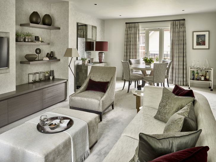
Susan split the long rectangular space into two zones: a living area and a dining room.
The brief
Jenny had bought the two-bedroom apartment as her retirement home. As it was a new build, and she had sold all her furniture, it was a blank canvas and provided the opportunity for Jenny to rediscover her style. ‘She wanted something sophisticated but not too grand or over the top,’ says Susan. ‘Jenny is well-read and loves going to the theatre and galleries and meeting like-minded people and wanted a relaxed, elegant space that reflected this.’
The design concept
Susan drew up a detailed design analysis that pinpointed what materials and colours Jenny preferred and assessed how she would use the space. ‘I needed to take into account that the grandchildren would visit, for example,’ she said, ‘so the furniture would need to be robust enough to withstand them!’
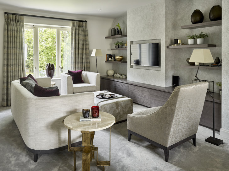
That established, Susan put together a presentation for each room which Jenny used to select things that she liked and disliked. ‘This helped me build up a picture of what she wanted – a visual map,’ says Susan. Jenny wanted her home to be light and bright with a focus on texture and beautiful, natural materials. ‘It’s quite a neutral space,’ says Susan, ‘so I added textures like travartine on the sidetables, veneered wood and faux shagreen to give it more character.’
The colour palette was light grey with soft creamy taupe undertones punctuated with deep marsala in the living area. ‘Jenny chose the colours she preferred, then I established what tones would work best. I thought the the red would warm up the all the grey and neutral tones. I avoided blues to keep the colours warm throughout.’
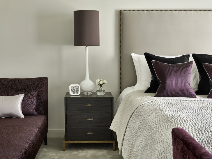
In the bedrooms, Susan chose different accent colours: purple for the master bedroom and pink for the guest bedroom. These are delivered via accessories and pieces of furniture: the master bedroom has a purple velvet ottoman and cushions, and the guest bedroom grey curtains with a pink trim and pink lampshades and cushions.

A low media unit and 'chimney breast' to house the TV were built and shelves erected. Furniture was kept low and curvey.
The process
The apartment was long and narrow and had an unattractive fireplace at its centre. ‘We removed the fireplace and zoned the space to create living and dining areas,' says Susan. ‘I designed a “chimney breast” to sink the TV into, and a low, unobtrusive media unit.’ Zig zag shelves on either side were installed to provide ample room to display objects and photographs, and a small stud wall was built between the two zones to give the suggestion of two rooms.
The furniture also accentuates the two areas: ‘The position of the sofa and chairs around the media unit made the living area feel distinct,’ says Susan. ‘And a sideboard, lamp and mirror made the other zone feel like a dining area.’
Furniture in tight, open-plan spaces should be chosen carefully, she suggests: ‘I always advise to go for a lower sofa; the curved back of this one creates a feeling of movement from one space to another.’ One chair matches the sofa and the other armchair is also low with lovely sweeping lines. ‘The sofa and chair don’t have back cushions,’ says Susan, ‘so Jenny can pile up lots of other cushions and still have room to sit comfortably.’

The grey colour palette continues into the master bedrooms, punctuated with purple accents.
The result
‘The pace is different with retired clients,’ says Susan. ‘They generally have more time than, say, professional couples. Often they are making a massive change, moving from a family home to a place of their own, so it’s important to approach the process sympathetically. I wanted Jenny to feel that I was on her side and that I would help her create a home that reflected her personality and style.’
This she achieved, and Jenny was delighted with the process and her new home. ‘Nothing was too much trouble for Susan,’ she says. ‘She spent hours getting colours, fabrics and measurements right, and sourced lovely pieces that I would never have found myself. I am particularly delighted with the media unit, which she designed and had made. The overall effect was exactly what I had wanted: a home that is modern yet classical and elegant.’
Photographs by Nick Smith.


