Get Inside Design
Insights into the world of interior design - straight to your inbox.
Introducing colour into your interior
Tempted to try a colourful palette for your interior design but dont know how or where to start?
As interior design moves away from greys and beige towards a more colourful approach, we find that clients increasingly want to introduce a more vibrant scheme into their homes but don’t know how to go about it. We advise them to talk it through with one of our interior designers, who will be able help them decide how to use colour most effectively in their home.
One designer, Tiffany Duggan of Studio Duggan, especially loves the richness, warmth and personality that colour brings to a home. We matched her with a client who wanted a total refurbishment of his house in Notting Hill (images below) and a designer who understood his style. 'He liked strong colour and urged us to use it,' says Tiffany. 'Anything we showed him that was a little bit weaker wasn't right.'
With this knowledge, Tiffany was able to confidently source colourful tiles, fittings and soft furnishings, and to be playful with pattern. By judicious use of both and by keeping walls plain, the result was a rich, textured, yet considered, interior.

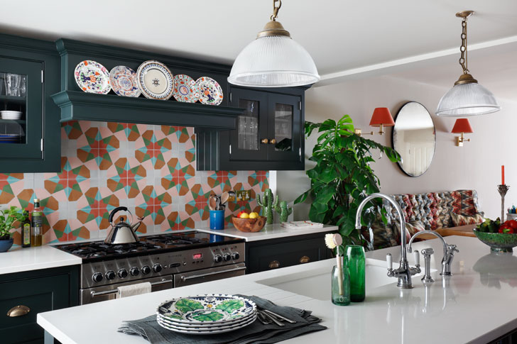
The bold, patterned tiles in the Notting Hill kitchen are anchored by cabinets painted a dark green
We asked Tiffany to tell us more about how she introduces colour it into an interior scheme and to talk through her design process.
Discover your colour palette
Colour is personal and subjective, and the only way an interior designer can understand what a client prefers, is to get to know them really well. ‘Some clients have a good idea of what they want and how they want the house to feel,’ says Tiffany, ‘but others don’t know how to create a clearly defined personal style. We sometimes find that our clients are happy to take risks when it comes to fashion, but when it comes to their homes, they get nervous and play it safe.’
At the start of each project, Tiffany holds a Design Analysis Meeting in her studio, where she presents clients with images, fabric and wallpaper, to discover what they like and what they don’t. Colour can be introduced in many ways, through fabric, tiling, flooring as well as painting walls and skirting boards, and this process gets them to think widely. ‘Because this is a general chat and is not directly about their homes, it frees up their thinking. A pattern then emerges of the colours they are comfortable with.'
Other clients come to the meeting with already formed opinions. 'The owner of the Notting Hill house had really good taste and a good understanding of what he liked and what he didn't,' says Tiffany. 'When we had the Design Analysis Meeting with him, this became clear and as a result we were able to progress the design work quickly."
Think about the whole of the house
To make colour work effectively and to create a cohesive result, it's important to consider the entire house at once, rather than individual rooms. ‘You don’t stay in one room,’ says Tiffany, ‘you constantly move around the house, transitioning from one space to another.’ What you see is not confined to one ‘shot’ like an image in a magazine, but encompasses hallways, staircases, glimpses or other rooms. ‘Although you might not be able to see the hallway when you are in the kitchen, you’ve just walked through it and the memory of it is still in your head. All the colours have to fit comfortably together.’

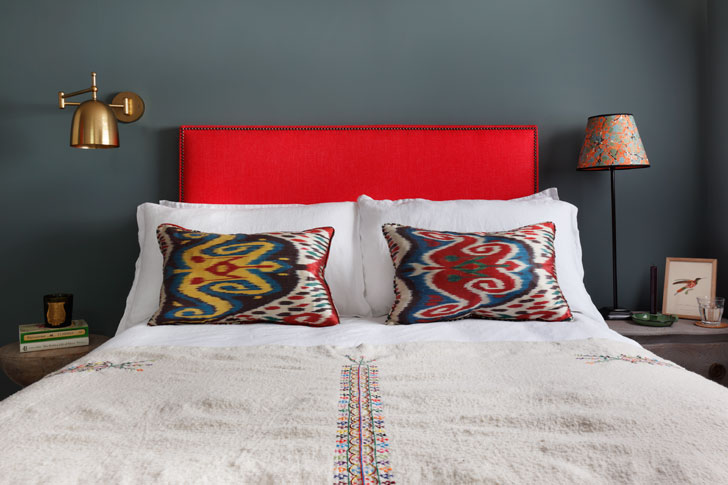
The bright red headboard and patterned cushions in the guest bedroom sing out against the dark walls
Start with spaces used for short amounts of time
Anyone who is cautious about using bright or bold colours should experiment in smaller rooms where they don’t spend a lot of time. The downstairs loo is the perfect place to be more daring and take a risk. ‘It’s become the fun place,’ says Tiffany. ‘It’s where people tap into what they might like to do elsewhere but lack the confidence to do so yet.’
Guest rooms can also be treated more adventurously. In the Notting Hill house, Tiffany painted the walls of the guest room a dark colour, above, confident that the room was light enough to take it. 'I don't think painting the walls dark makes the space dark necessarily,' she says. 'The light carpet, white ceiling, bedlinen and joinery ensures that it feels bright.'
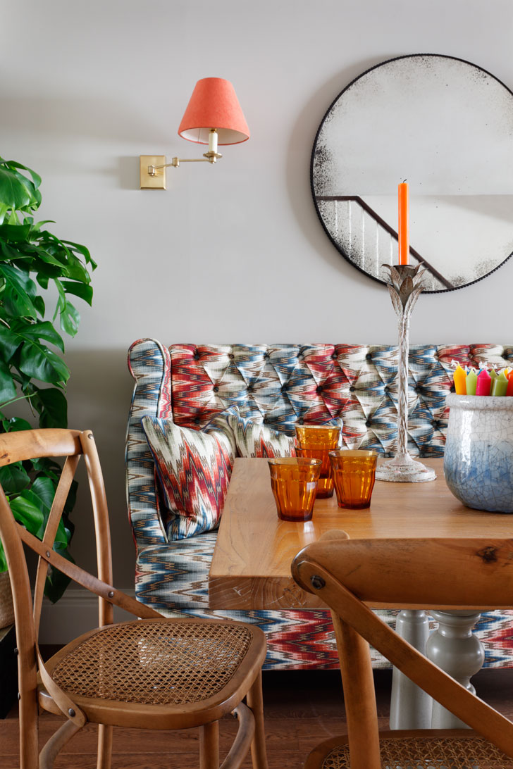
The colourful, patterned sofa in the dining area is complemented by neutral walls.
There are no rules
According to Tiffany, when it comes to colour, there are no rules and any that do exist she disregards. One of these is to always paint smaller spaces in lighter colours. ‘I don’t agree with that,’ she says. ‘I think darker colours push back the walls by blurring the boundaries of a room. If you paint smaller spaces white, they just become dull.’
One guideline she does follows, however, is to choose all the elements in an interior design at the same time. ‘Don’t paint your walls first and then, later on, choose tiles, flooring or fabric,’ she says. ‘One mistake I often see is walls painted with pale colours and then lots of riotous colour and pattern added afterwards. Start with the big picture – how you want the house to feel – and then assess whether it is a dark space or a light space. Then you can hone things down and concentrate on the details, like what fabric is right for the couch, the material for the curtains, and so on.’
What you must never do, she suggests, is be afraid of paint. ‘It’s funny but people get really nervous about paint,’ she says, ‘and it’s just paint. They are more willing to take risks with tiles or hard finishes that are more difficult to change. Paint can be painted over.’

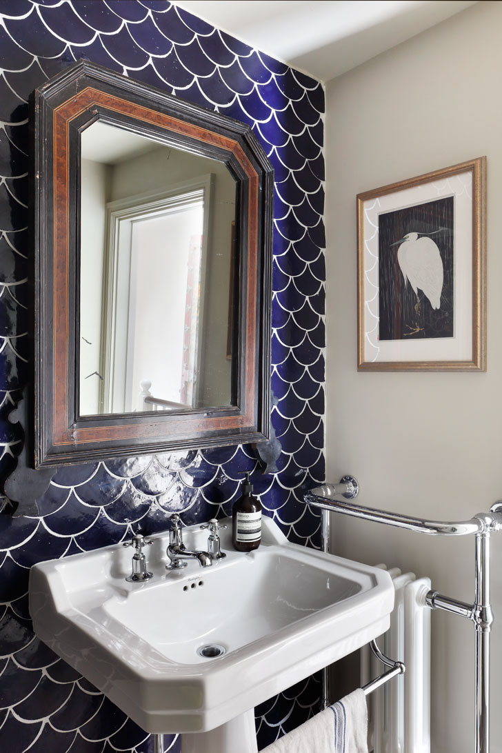
The bathroom has dark-blue fish-scale tiles, which look smart against the white sanitaryware
Don’t be afraid of the dark
Tiffany is a fan of dark colours and encourages her clients to include them in their schemes where appropriate. ‘I love dark walls,’ she says, ‘but they are not for everyone or every space. I think they work especially well in transitory spaces like staircases and halls; many London houses have dark hallways with no windows, a darker colour there complements the light colours of the rooms coming off the hallway, and creates a warm and inviting mood. It also hides a multitude of sins where there is high traffic.’
Tiffany tiled one wall of the bathroom of the Notting Hill with dark blue tiles, below. 'The room can really take the colour,' she says, 'and the fish-scale shape of the tiles adds a patterned element.'
Reception rooms can also benefit from a darker palette, especially if you are lucky to have two. ‘Then you could keep the open-plan kitchen and seating area nice and light,’ says Tiffany, ‘and paint the other, more formal, room with a stronger colour and use it in the evenings.’
And if you want to create a really cocooning space – in a bedroom, for example – Tiffany suggests painting walls and ceiling the same dark colour.
'Colour can really affect your mood,' says Tiffany, ' and it reflects your personality, so it's an important element in creating a home. All those grey and white interiors are looking a bit dated now and they limit what you can add to them. A balanced, considered, colourful home continues to grow as you develop.'
If this has inspired you to talk to one of our designers about a new colourful scheme for your home, contact us and we'll match you with the right one for your project.


